Marguerite Huré (1896-1967) was a master glazier who collaborated with Auguste Perret, the modernist architect and Maurice Denis, of the art movements les Nabis and the Symbolists. This is an examination of her use of colour as abstract symbolism in the stained glass of the postwar church of St-Joseph in Le Havre, France. It was written for my second stage work at the University of Sunderland.
The church of Saint-Joseph was designed and executed by the architect Auguste Perret (1874–1954) as part of the reconstruction of Le Havre after the town’s near-destruction in WWII. Perret was tasked with the full task of rebuilding the whole town which included the
seafront and housing (Figure 2).
Earlier in her career, Huré worked with Perret and Maurice Denis (1870-1943) on stained
glass in the Church of Notre-Dame de la Consolation in Raincy (Figure 3). Perret built a studio for Huré in the Paris commune of Boulogne-Billancourt [Unesco].

Figure 3 Huré and Denis’s geometric panels of stained glass in Notre-Dame de la Consolation in Raincy, France
Perret was long at the forefront of modernist architecture (he taught Le Corbusier). Perret’s
use of concrete and prefabricated forms for the construction of the church and housing was
a necessary response to the urgent need for quick results. However, he reused his ‘New
York skyscraper’ design from the 1920s for the church (Figure 2). It is arguable that the design could not have been realised until this project was undertaken. Much experimentation in
materials was required, resulting in a breakthrough with ‘pre-stressed concrete’ which
provided structural integrity in the buildings [Unesco].
A beautiful example of the application of this innovative technique is The Saint-
Joseph Church … The format adopted was that of a bell-tower, in which a tower
lantern forms a unit with the nave of the church. With pre-stressed concrete it was
possible to solve a problem that had been studied extensively in the Middle Ages:
four groups of four pillars of 1.20 m × 1.20 m resting over concrete wells at more
than 12 m depth, support the tower itself at 25m high through four V shaped
brackets. These transition elements support the bell-tower and the total height of
the church which is 104 m [Cruz, p1434].

Figure 2. Cohen, J 2015, France : Modern General view of Le Havre, rebuilt after WWII
From Architectures in History, Reaktion Books, Limited,
London. Available from: ProQuest Ebook Central. [17 November 2021]
Parallel reconstruction in Coventry
Saint-Joseph was just one of many churches that required rebuilding after the war on both sides of the English Channel. During the same period, Coventry Cathedral was built anew alongside the remains of the medieval church, in part to conserve some of its original stained glass by John Thornton (who later made the windows in York Minster) [coventry].
Unlike Perret’s entirely 20thC design, Coventry’s architect, Sir Basil Spence, may have based chose a more conciliatory, if ‘curious mixture’ of arts and crafts with a modernist style [Reyntiens, youtube]. He used sandstone for the exterior, but, like Perret, used concrete for structural support, in the form of cruciform piers in the interior and flat concrete slabs for the roof [Historic England].
Many artists were employed at Coventry but the focus here is on the baptistry window. It was a collaboration between the established artist John Piper (1903-1992) and recent arts graduate Patrick Reyntiens (1925-2021), who rendered Piper’s design. The window is behind the ‘enormous nutmeg grater’ façade and Piper was at a loss for what to do. He tried various designs, including ‘an elephant, then a whale and then … the idea of faces in each of the squares … that would have been absolutely frightful’. None of the ideas were suitable [Reyntiens, youtube].
It was Reyntiens who pushed the Coventry designs in the direction of pure abstraction (Figure 4), a Bernini-inspired “explosion” of colour that would overcome the limitations of the stone mullions that broke Piper’s design into 198 lights [Guardian].

Figure 4. The Bapistry window at Coventry Cathedral (The Guardian)
John Piper’s design was rendered using surplus traffic light green glass (bought on the cheap); painted and fired stained glass, and multiple layers of glass to achieve specific hues and a unity of colour [Reyntiens].
In contrast, Huré’s design for Saint-Joseph (Figure 9) is made up of 12,768 panes of entirely unpainted, mouth-blown glass made using ‘the ancient technique’ [Unesco]. The design comprises: Elongated vertical windows containing geometrical openings (or claustras) whose
color mix produces a vast “symphonic poem”… The pieces of glass follow a symbolic system ordering colours and shapes according to the research effected by the Atelier d’Art Sacré (the Sacred Art Workshop) on theological virtues [Unesco].
Huré’s choice of block colours in simple, repeating geometric shapes for the window is consistent with the non-representational aesthetics of modernism. The design, using many geometric panes, is reminiscent of the work she had done with Denis and Perret decades previously in Raincy (Figure 3). In particular, the geometry in the layout shown in Figure 5 evokes a subtle cross-like effect when seen from a distance.
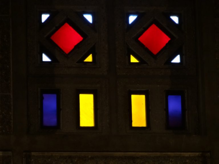
Figure 5 Detail of window from St Joseph, Le Havre
Simplicity of colour and the Ateliers d’Art Sacré
Huré had a long association with Denis, who, along with Georges Desvallières (1861-1950) founded the Ateliers d’Art Sacré’ or Sacred Art Workshop in 1919. The Atelier’s philosophy was to restore art to churches ravaged by war in ‘an aesthetic, traditional and modern character’ [Lebée]. Denis is perhaps better known as a founding member of “Les Nabis”, a late 19C movement associated with Cézanne) whose members were ‘disaffected by the photographic realism’ they were taught at the Académie Julien in Paris [Dempsey, pp50-51]. Denis was associated with colour and its use in symbolism in art. Denis famously said, early in his career with Les Nabis that ‘A picture — before being a war horse, a female nude, or some anecdote — is essentially a flat surface covered with paints in a particular order.’
This statement, slightly altered, came to express the aesthetic programme of
Symbolism: “… the sounds, colours and words are wonderfully expressive regardless
of any representation; indeed, regardless of the actual meaning of the words”
[Kostenevitch].
Due to Huré’s prior collaborative work with Denis, it is assumed that she avoided a naturalistic or representational approach with the intention of evoking an emotional response. Her colour choices would have been influenced by the principles of the Atelier d’Art Sacre when assigning symbolism to the colours used in the church’s claustras. There is a further assumption that because Denis was a Franciscan [Kostenevitch], the Atelier’s system follows the Catholic Church’s liturgical colours of red, white, green, violet, plus yellow and blue [Vanderbilt] – as indeed, these are the colours used in the panes. Le Havre’s Etretat Tourisme website specifically mentions the use of ‘liturgical principles’ along with ‘religious mysticism’, both of which tends to support that assumption.
Perceptions of colour and difficulty assigning symbolism
Assigning symbolic meaning to any colour is problematic on several levels: firstly, due to the physical nature of colour and human responses to it; secondly due to cultural imperatives; and finally in regard to the changing nature of historical interpretations.
Firstly, consideration must be given to the question of what colour actually is and how we come to be aware of it. Colour is not a thing, it is a process; ‘a labyrinthine operation, arising from a long chain of physical, chemical and biological events’ [Fox, Intro]. It is a combination
of light (ie. electromagnetic radiation on a spectrum) striking a material and perception of that event by a viewer and processed through the viewer’s own senses. This means that colour perception is unique to each individual, even before taking into consideration colourblindness.
For example, a red/green colour deficiency is ‘a common problem that affects around 1 in 12 men and 1 in 200 women’ [NHS].
Secondly, different cultures around the world have different responses to specific colours. Red, for example, is associated in English-speaking countries with anger (we see red), but in ancient Chinese culture, red has been linked to summertime and joy, and is still considered
a lucky, happy colour [Fox, Ch. 2]. Some cultures ascribe little meaning to colour at all. In 1971, colour researchers were told on Bellona Island in Polynesia that ‘we don’t talk much about colour here’ [Gage, p30]. Blue is particularly interesting, in that non-technological
societies rarely even have a word for it. Colours are named after tangible, material things that can be held and manipulated, such as rocks and wood. The sky and mountains in the distance are obviously blue but neither can be touched in a practical way, so the word for
the colour tends to enter language much later than, say, red, the colour of blood. The words for blue in French, Spanish, Portuguese and Italian are all based on the mineral lapis lazuli from Afghanistan that was widely traded for its rich pigment all along the Silk Road [Fox, Ch.
4].
If a culture does not recognise colours as significant enough to name, then assigning symbolism to colours will not happen; and if it does, the assignment is highly unlikely to be consistent across different cultures or even, as with the Maya in Central America, within the same culture. Both the Maya and Aztecs used colour to signify the cardinal directions but in a wildly inconsistent way. Even within pages of the same manuscript, ‘north’ might be symbolised as black, red, yellow, blue or grey [Gage, p110].
Symbolizing belongs to metaphor rather than to perception, and is thus a linguistic, and specifically rhetorical, not an immediately psychological function of mind… [Gage, p109].
Changing perceptions of colour over time
Across time, the language and perceptions of colour has changed dramatically. In the western world, our perception of colour and the language we used to describe it is primarily based on hue, that is, whether it is green, blue or red. In medieval times, the ‘conception of
colour in this period was … essentially a brightness or values-based one’. In other words, lightness and darkness were considered more important than the hue, primarily because of the instability of pigments. That did not stop medieval scholars and clerics from assigning
colours symbolically, but it was ‘often mutually incompatible: in a single twelfth century manuscript … even the colour-symbols of the Trinity are not constant’. Of hues, only black, white and red had achieved a standard meaning by the 1200s, (echoing the way colour
names tend to enter language as Fox described above). Bede in the seventh century ascribed the purple of amethyst ‘as emblematic of heaven’, an attribute that would by the later medieval period be given over to blue. Blue itself changed from being considered a
dark colour to a light colour during that time, possibly because of its use in stained glass. Only Christ’s white (or gold) robe held steady with a single symbolic meaning (of purity) in images from the sixth century onwards. [Gage, pp 68-70, 73].

Figure 6a – Stained glass nativity at Chartres [Witzleben]
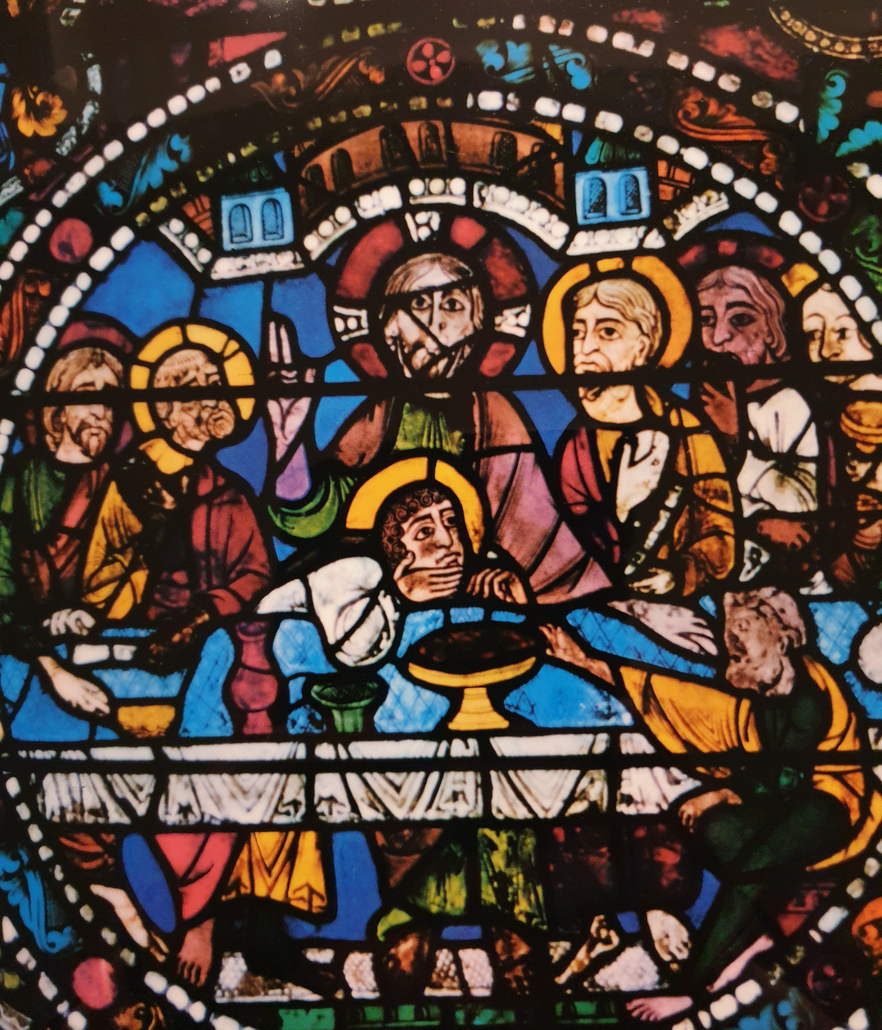
Figure 6b Medieval stained glass from Chartres [Witzleben]

Firgure 6c Medieval stained glass from Chartres
Historically, then, there is much inconsistency in the way colours were designated symbolically within the Catholic church in Europe, where one might have expected a unified approach.
Note the varying colours of the twelfth century halos of baby Jesus – as blue in the Nativity (Figure 6a) compared to red for adult Jesus at the Last Supper (Figure 6b). A hundred years later, there is even more variation in the angels’ halos. (Figure 6c). All windows are from the same cathedral, Chartres.
Denis’s contribution to these ever-changing roles of colour was not necessarily to prescribe particular colours (although the assumption is that as a Franciscan he would have been drawn to the liturgical colours), but more of a rejection of what he saw as the soulless character of naturalism. His goal seems to have been to embrace the symbolist ideas of expression and emotion through colour:
The artist must seek, in Cézanne’s words, not to reproduce nature, but to represent
it, through equivalents… It is the means of expression (lines, shapes, volumes,
colors), and not the object represented, which must itself be expressive”. For
Maurice Denis, this definition of a work of art could, and even had to, be put at the
service of Christian art, because it led to the alliance between decoration and
expression, between “ornament and poetry” and to “avoid trompe-l’oeil and lies”.
What is pleasing to the eye must also nourish the mind and, as in the Middle Ages,
must teach [Art-Sacré].
Huré’s glass does follow the liturgical colours, although the effect of sunlight passing through the panes will create a mosaic of changing hues and tones (Figure 7). The simple geometric layout and the arrangement of the colours has been described as a ‘symphonic poem’ [Unesco]. Unlike Piper’s design in Coventry with its giant sunburst of yellow emphasised by blocks of colour with gentle gradients, there is no focal point to the design in the Saint-Joseph lantern. Instead, the colours change subtly as they rise to the top, seemingly at random.

Figure 7, interior St-Joseph, Le Havre. Photo by Michel Denance
References
1. Unesco, Le Havre, World Heritage Site. http://unesco.lehavre.fr/en/understand/artists-at-work-during-the-reconstruction
(and other pages)
2. Wikipedia – Ateliers d’Art Sacré
https://en.wikipedia.org/wiki/Ateliers_d%27Art_Sacr%C3%A9
3. Lebée, Daniel. Les Ateliers d’Art Sacré: un nouvelle practique de l’art chrétien (no date) http://www2.culture.gouv.fr/culture/inventai/itiinv/archixx/pann/p35.htm
[using Google translation of]: ” «fournir aux églises et spécialement aux églises dévastées par la guerre, des oeuvres religieuses d’un caractère à la fois esthétique, traditionnel et moderne»”
4. Styles, Schools & Movements, Amy Dempsey, p “les Nabi”
5. Kostenevitch, Albert. The Nabis, Parkstone International, 2009. ProQuest Ebook
Central, http://ebookcentral.proquest.com/lib/sunderland/detail.action?docID=887075.
Created from sunderland on 2021-11-17 11:31:08.
6. (Image, general view of rebuilt le havre) Cohen, J 2015, France : Modern Architectures in History, Reaktion Books, Limited,
London. Available from: ProQuest Ebook Central. [17 November 2021].
7. Fox, James The World According to Colour: A Cultural History
8. NHS. Colour vision deficiency (colour blindness) https://www.nhs.uk/conditions/colour-vision-deficiency/
9. Gage, John. Colour and Meaning: Art, Science and Symbolism
10. Historic England. Cathedral of St Michael {at Coventry} https://historicengland.org.uk/listing/the-list/list-entry/1342941
11. https://www.youtube.com/watch?v=lbN9RIhFRTQ BBC programme excerpt on Coventry Cathedral Patrick Reyntiens
12. The Guardian, ‘Patrick Reyntiens obituary’ 19 November 2021 https://www.theguardian.com/artanddesign/2021/nov/19/patrick-reyntiensobituary
13. Le Havre Etretat Tourisme. https://www.lehavre-etretat-tourisme.com/decoouvrir/les-incontournables/eglisesaint-
joseph-du-havre/ (12,768 pieces of mouth-blown glass)
14. Liturgical Colors, Revised Common Lectionary, Vanderbilt Divinity Library, Nashville. https://lectionary.library.vanderbilt.edu/liturgical-colors.php
15. Denis, Maurice. Nouvelle theories sur l’art moderne [et] sur l’art sacre, 1914-1921.
16. 1922. Paris, L. Rouart et J. Watelin – https://archive.org/details/nouvellesthori00deniuoft
17. Images of stained glass halos from Chartres. Witzleben, Elizabeth von. Les Vitraux
des Cathédrals de France. Plates V, VI (12C), XXV (13C)